HR dashboards: 7 examples that turn people data into action
.png)

Every HR team has data, but the real difference lies in how clearly you can see what it’s trying to tell you. Most traditional HR dashboards tell you engagement dropped 8 points or turnover increased 12%. What they don’t tell you is why: which team, which issue, or what to do next.
That’s where modern, interactive dashboards make the difference. When HR leaders can connect data to real business and people outcomes, they’re driving change and not simply tracking data.
Leaders who use interactive dashboards and data-driven insights are 68% faster at generating actionable insights and see 24% lower attrition rates.* This guide shows seven HR dashboard types built to drive decisions, and not simply display metrics:
- Engagement dashboards that flag declining sentiment before top performers leave
- Turnover dashboards that predict flight risk three months early
- Performance dashboards that reveal rating inconsistencies during calibration
- Compensation dashboards that compare offers against market rates
- Goals dashboards that expose stalled priorities
- Learning dashboards that connect training to outcomes
- People overview dashboards that give executives workforce intelligence in minutes
Each example demonstrates what to track, why it matters, and how to make it actionable through the ARC framework: Actionable (predictive alerts that surface next steps), Real-time (data that updates as events occur), and Comparative (benchmarks that provide context).
By the end, you'll understand how modern HR dashboards move from retrospective reporting to strategic foresight.
📊 See people analytics in action
Explore how Leapsome's dashboards turn engagement, turnover, and performance data into actionable insights.
👉 Learn more about our analytics
*Sharma, Nalin Dev, Aswath, Anant Verma, and Suganthi Suresh
Engagement dashboard to act on sentiment before morale declines
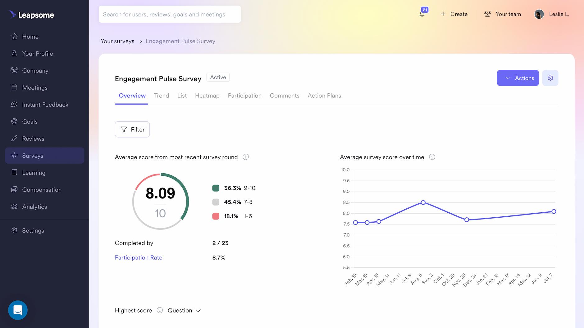
Engagement dashboards track employee sentiment and participation to identify retention risks before top performers start interviewing elsewhere.
Most HR teams collect employee engagement data regularly. Then it sits in spreadsheets for weeks while managers wait for custom reports. By the time someone spots declining sentiment, top performers have already started interviewing elsewhere.
The stakes are measurable. Our 2026 Workforce Trends Report found that when disengagement takes hold, 60% of leaders report lower performance, 48% see increased burnout, and 47% observe rising conflict and toxic behaviors. Early warning signals matter because the window to intervene shrinks quickly once sentiment starts declining.
Core metrics to track in an engagement dashboard
An engagement dashboard needs four core metrics to move from sentiment tracking to retention action:
- eNPS (Employee Net Promoter Score): Tracks loyalty on a -100 to +100 scale. A declining eNPS signals attrition risk before resignation letters arrive, creating an early intervention window.
- Survey participation rates: Shows which teams engage with feedback and which ignore it. Low participation (below 60%) typically indicates either a lack of trust or poor manager engagement.
- Favorability scores by driver: Breaks down sentiment by category (communication, workload, recognition, autonomy, growth). Transforms aggregate scores into specific, actionable interventions.
- Trend analysis over time: Compares current scores to previous cycles to spot momentum shifts and measure intervention impact.
Tracking core metrics with an engagement dashboard
An effective engagement dashboard should let you filter by department or team, compare results across survey cycles, and visualize trends over time. AI-powered text analysis of open-ended responses saves hours of manual review by automatically surfacing common themes.
In Leapsome, this works through Analytics > Surveys, where real-time insights populate from all engagement surveys. The platform's AI automatically generates summaries of open-ended responses, identifying patterns without manual analysis.
AI text analysis can reduce survey analysis time from hours to minutes while surfacing patterns human reviewers might miss.
🔗 Stop pulling manual reports
Leapsome's HRIS consolidates performance, engagement, learning, and compensation into real-time dashboards.
👉 Take a tour
Turnover dashboard to identify flight risk long before people leave
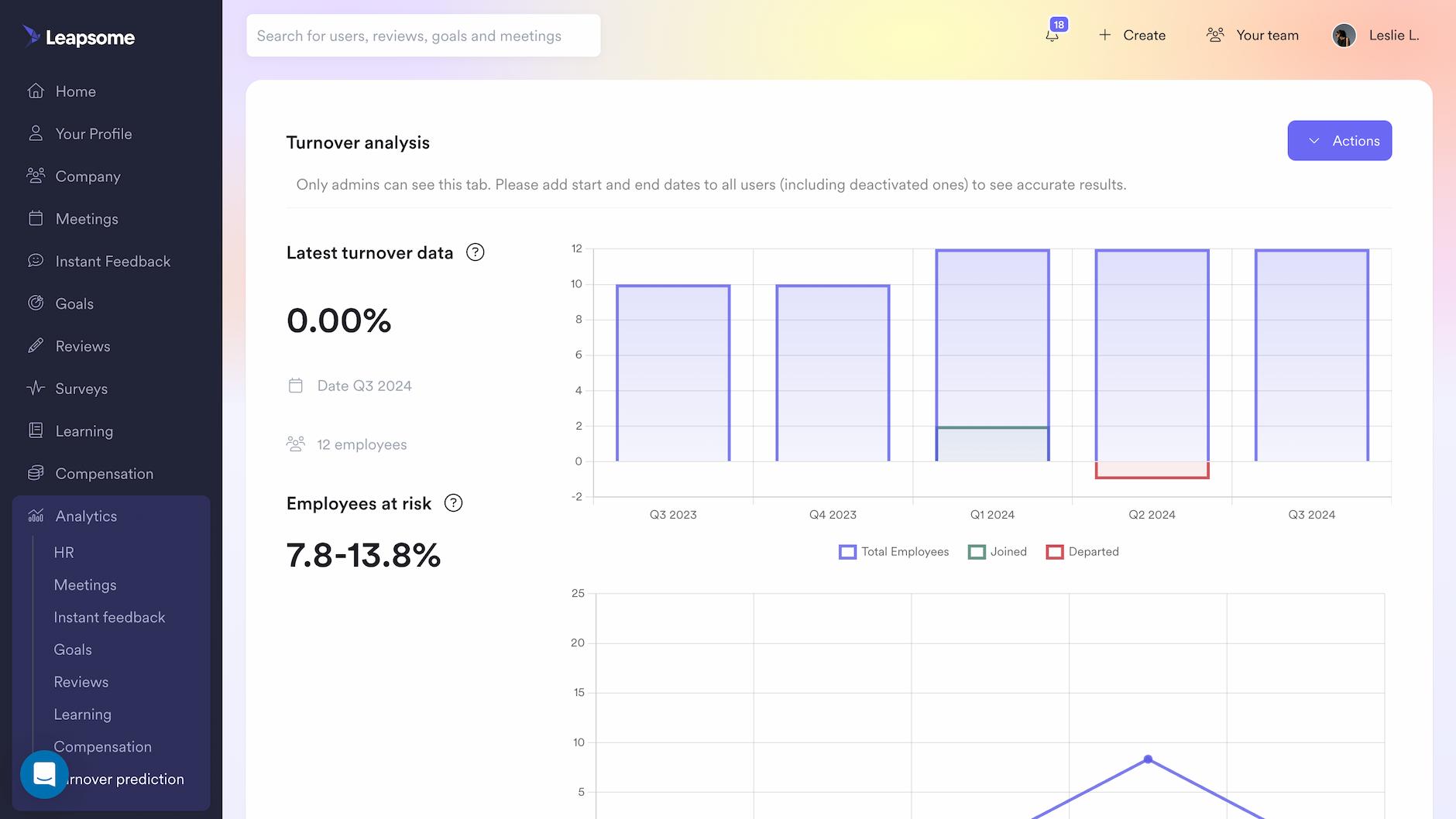
This dashboard uses historical patterns to predict which employees might leave, creating time to intervene rather than simply documenting departures.
Most organizations measure turnover the way forensic teams arrive at a crime scene: after the damage is done. By the time HR sees the spike in departures, top talent has already accepted offers elsewhere.
The 2026 Workforce Trends Report uncovered a retention paradox: 30% of employees want to leave their workplace, yet 54% are staying for reasons other than liking their work—many trapped by fear of the competitive job market. Predictive dashboards help HR distinguish between engaged employees and those who are simply staying out of necessity, enabling targeted retention efforts where they'll actually work.
Core metrics to track in a turnover dashboard
A predictive turnover dashboard requires four metrics to identify flight risk before employees resign:
- Attrition trends over time: Historical turnover rates segmented by quarter to identify seasonal patterns and sudden spikes. Reveals whether departures cluster around performance reviews or compensation discussions.
- Turnover rate by team and role: Department-level and function-level breakdowns to pinpoint retention risks in critical areas. Exposes where retention investment should concentrate rather than spreading resources uniformly.
- Regrettable vs. non-regrettable departures: Classification of exits to distinguish between high performers you wanted to retain and planned separations. Quantifies the quality of attrition, not just volume.
- Predictive risk indicators: Employee-level attrition scores based on engagement data, performance trends, and tenure patterns. Identifies at-risk employees months before they start interviewing, creating an intervention window. Machine learning research on employee turnover shows that job role, promotion history, tenure, marital status, and age are the most influential predictors of turnover risk.
Tracking core metrics with a turnover dashboard
A predictive turnover dashboard should calculate risk scores from engagement data, performance reviews, and tenure patterns. It needs to segment employees into risk categories and flag individuals whose scores have recently increased. Real-time updates ensure you can act before employees start interviewing.
In Leapsome, Analytics > Turnover Prediction provides continuously updated risk scores filtered by team, department, or seniority. The platform automatically segments employees into low, medium, and high-risk categories.
Predictive models typically need sufficient historical data to identify patterns—test accuracy with your top 10 flagged employees before rolling out to managers.
Performance dashboard to ensure calibration consistency
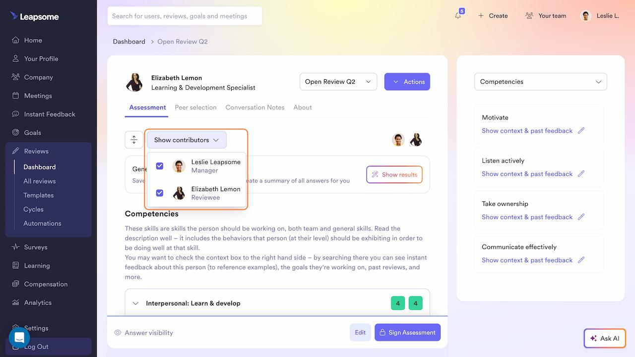
Performance dashboards reveal rating inconsistencies across teams and connect evaluation outcomes to goal achievement, ensuring fair and credible talent decisions.
Core metrics to track in a performance dashboard
These are four key metrics that a performance dashboard can have to ensure calibration fairness and connect ratings to outcomes:
- Performance rating distribution: Shows how ratings are spread across teams. If one department rates 85% as "exceeds expectations" while another rates only 45%, that reveals inconsistent standards and unfair compensation.
- Goal completion rates: Tracks whether employees actually achieved their objectives. Prevents performance inflation by tying ratings to measurable outcomes rather than subjective assessments.
- Review cycle progress: Tracks who's completed reviews and who hasn't. Identifies bottlenecks before deadlines pass and reviews drag into the next quarter.
- Performance trends over time: Shows whether ratings are improving or declining across cycles. Validates that development efforts are working and flags employees who may be at flight risk.
Tracking core metrics with a performance dashboard
A performance dashboard should track review completion status, display rating distributions by team, and show performance trends over time. The key differentiator is calibration functionality: compare manager ratings against peer and self-assessments to surface bias before reviews are finalized. AI-generated summaries provide managers with talking points for development conversations.
In Leapsome, Reviews > Dashboard provides real-time tracking with filtering by review cycle, department, or manager. The calibration view highlights misalignment between manager ratings and other assessment sources before final reviews lock.
When evaluating HRIS platforms, look for calibration tools and AI-powered performance summaries alongside basic rating tracking.
Learning dashboard to connect training to business outcomes
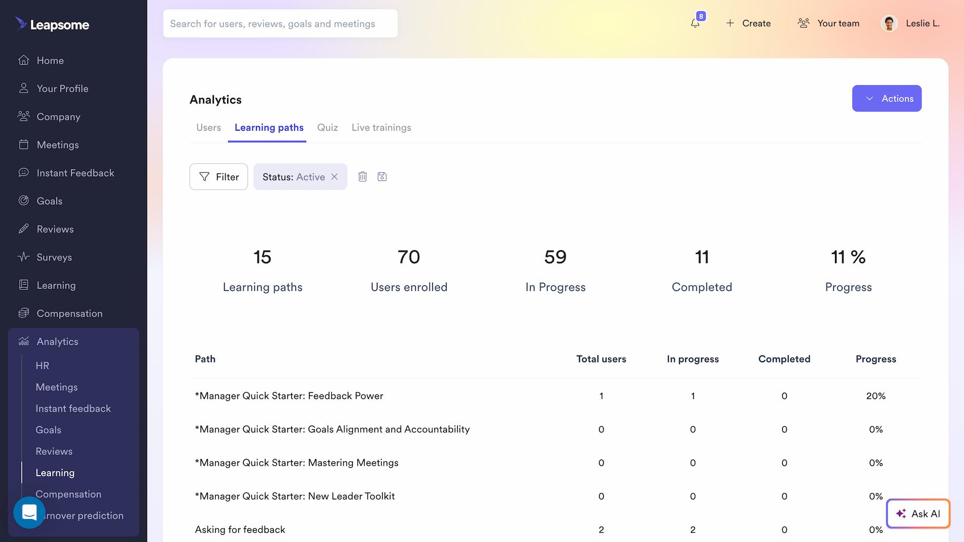
Organizations invest heavily in learning and development programs. Then L&D teams track course completions and enrollment numbers while executives ask the question no one can answer: did any of this training actually improve performance?
Learning dashboards prove whether development programs actually improve results or just consume budget by tracking completion rates and linking training to performance outcomes.
Core metrics to track in a learning dashboard
A learning dashboard can include the following metrics to prove training drives measurable improvement:
- Training completion rates by team: Shows which departments prioritize development and which don't. Low completion rates signal either irrelevant content or managers not creating time for learning.
- Skill gap analysis: Identifies where employee capabilities fall short of role requirements and strategic priorities. Connects learning to business outcomes by highlighting critical capability gaps.
- Time spent in learning modules: Tracks engagement depth beyond simple completion checkboxes. An employee who finishes a 45-minute module in 12 minutes either skipped content or already knew it.
- Correlation between learning activity and performance improvements: This link between training and measurable performance gains in subsequent review cycles proves ROI by showing whether employees who complete specific paths show improved outcomes.
Tracking core metrics with a learning dashboard
A learning dashboard should track completion rates and engagement by team, identify stalled learners who haven't progressed in 30+ days, and benchmark completion across departments. Advanced platforms connect learning to performance by recommending courses based on skill gaps identified in reviews and career conversations.
In Leapsome, Analytics > Learning displays real-time completion rates with filtering by learning path, user group, or status. AI recommends the next courses based on performance review insights and career goals.
Look for platforms that connect learning recommendations directly to skill gaps identified in performance reviews and career conversations.
🚀 Build dashboards that drive decisions
See how Leapsome's people analytics help HR leaders move from spreadsheet reporting to strategic foresight.
👉 Explore the Analytics
Compensation dashboard to ensure pay equity and market competitiveness
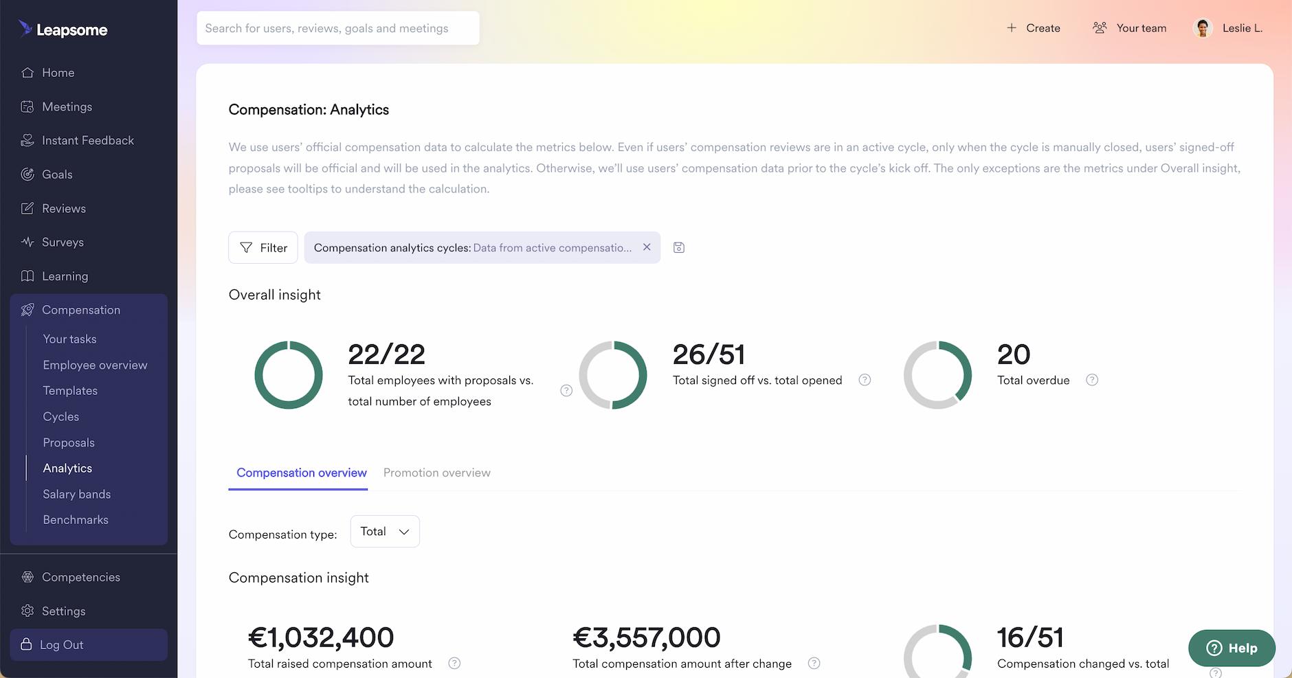
Compensation planning is one of the most sensitive HR processes. Yet most teams still manage it through spreadsheets, email chains, and manual calculations, creating compliance risks, pay inequities, and hours of administrative work.
Compensation dashboards show salaries, when people last received raises, and how offers compare to market rates. This exposes pay inequities and prevents you from losing talent to better-compensated competitors.
Core metrics to track in a compensation dashboard
A compensation dashboard can include four metrics to maintain pay equity and market competitiveness:
- Pay distribution by level and team: Shows how salary ranges cluster across roles, seniority levels, and departments. Exposes structural inequities before they become legal liabilities.
- Compensation vs. performance correlations: Links pay decisions to performance outcomes. Reveals when high performers are underpaid or underperformers are overcompensated, both of which erode morale.
- Pay equity analysis by demographics: Examines compensation gaps across gender, ethnicity, tenure, and other protected categories. Identifies and closes inequities before they become compliance violations or PR crises.
- Benchmark comparisons against industry standards: Positions internal compensation against external market rates. Validates whether offers remain competitive without overpaying.
Tracking core metrics with a compensation dashboard
A compensation dashboard should display salary adjustments, promotion rates, and pay equity breakdowns by demographics, with filtering by team, level, and location. Critical capabilities include benchmark comparisons against external market data and automated equity reports that flag demographic disparities before decisions are finalized.
In Leapsome, Compensation > Analytics provides real-time visibility with benchmark comparisons against Mercer salary standards. Equity reports automatically flag potential compliance issues before final decisions lock.
Benchmark integrations should update regularly—annual data becomes stale when you're making hiring decisions throughout the year.
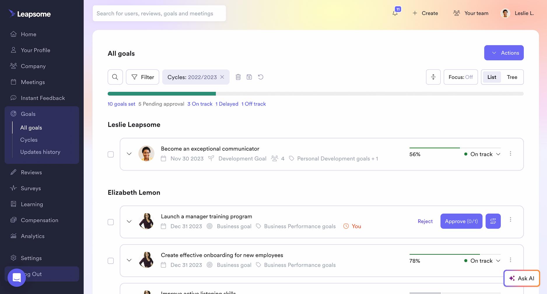
Goals dashboard to track strategic alignment across teams
Many organizations adopt OKRs or other goal frameworks. Then those goals live in silos, disconnected from performance reviews, invisible to leadership, and rarely updated until the next planning cycle arrives.
Goals dashboards visualize strategic alignment across the organization, showing whether individual work connects to company priorities or drifts into disconnected activity.
"People data analytics has transformed how we make decisions—from hiring to promoting—and has elevated the status of the HR team."
- Sonia Boyle, Chief People Officer at Gore Mutual Insurance
Core metrics to track in a goals dashboard
A goals dashboard can include these four core metrics to expose strategic alignment gaps:
- Company, team, and individual goal progress: Tracks completion status across all organizational levels. Exposes whether strategic priorities are advancing or stalled, and whether individual work connects to company objectives.
- Goal completion rates: Measures what percentage of goals that are achieved on time, behind schedule, or abandoned. Low completion rates indicate unrealistic goals, misallocated resources, or weak accountability.
- Alignment between individual and organizational objectives: Visualizes how individual and team goals connect to top-level company priorities. Quantifies what percentage of work effort directly advances strategic objectives versus legacy projects or firefighting.
- Overdue or stalled goals requiring intervention: Identifies goals that haven't been updated in 30+ days or have missed multiple check-ins. Creates accountability by surfacing inaction before deadlines pass.
Tracking core metrics with a goals dashboard
A goals dashboard should track real-time progress across company, team, and individual objectives with visual goal trees showing alignment relationships. The key capability is visualizing how individual goals cascade from team objectives to company priorities, immediately exposing orphaned goals that don't ladder up.
In Leapsome, Goals > All Goals displays completion percentages and alignment trees with filtering by time frame, owner, team, or department. Goal trees make misalignment immediately visible.
The most effective goal systems automatically cascade changes: when a company OKR shifts, aligned team and individual goals flag for review.
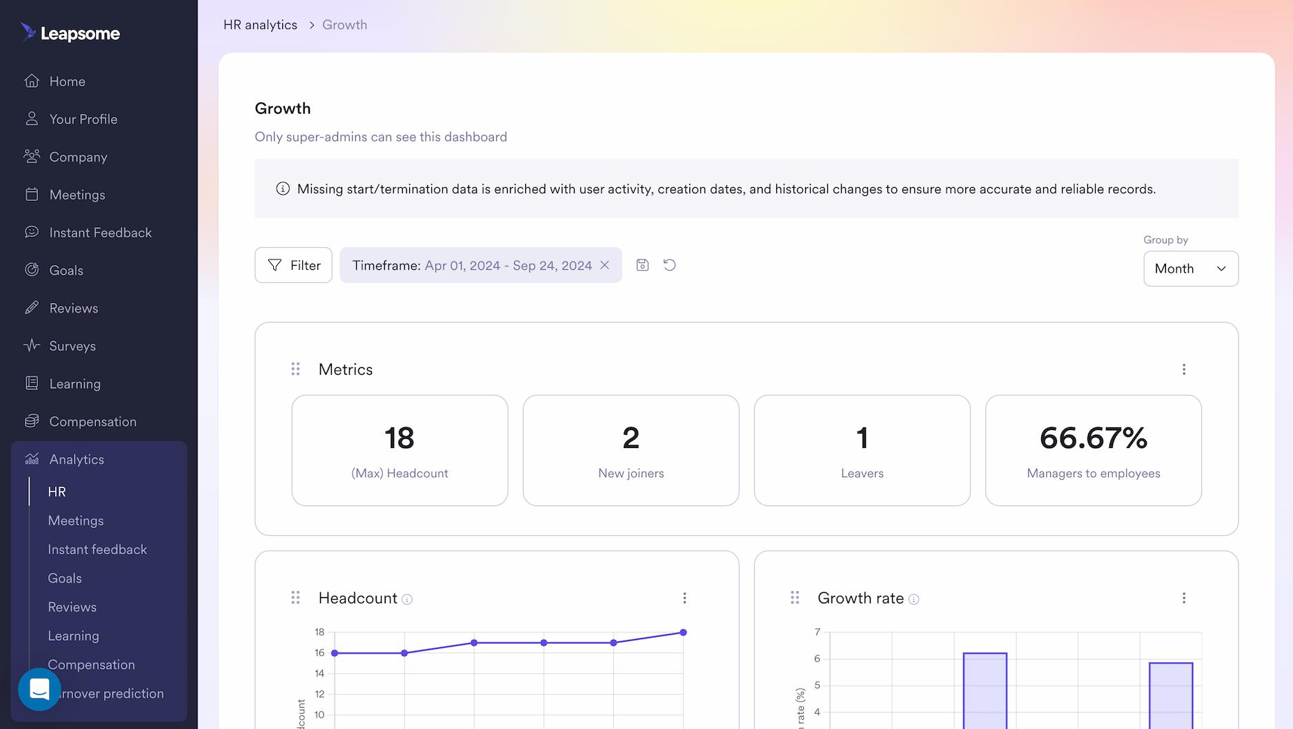
People overview dashboard to give executives workforce intelligence instantly
C-suite leaders ask for workforce analytics, and HR scrambles across five systems to assemble an answer. By the time the data arrives, the board meeting has passed, the budget decision is made, and HR's strategic credibility has eroded further.
An executive-level dashboard consolidates workforce health metrics, such as engagement, turnover risk, performance, and compensation, into one view that answers board questions without manual reporting.
Core metrics to track in a people overview dashboard
A people overview dashboard consolidates workforce health across four key metric categories:
- Headcount trends and growth patterns: Tracks total headcount, growth velocity, and hiring concentration across departments. Reveals whether expansion aligns with strategic priorities or organizational inertia.
- Engagement levels and participation signals: Monitors company-wide eNPS, pulse survey response rates, and favorability drivers. Declining engagement combined with falling participation creates a predictive window before attrition spikes.
- Performance distribution and calibration consistency: Analyzes rating patterns to surface grade inflation across teams and identify high-performer concentration by function. Validates that compensation decisions reflect actual performance outcomes.
- Predictive turnover risk and flight indicators: Segments employees into attrition risk categories using engagement data, compensation positioning, tenure patterns, and performance trajectories. Identifies flight risk before employees interview elsewhere.
Tracking core metrics with a people overview dashboard
A people overview dashboard should consolidate workforce metrics—performance, engagement, goals, learning, and compensation—into one executive view with drill-down capabilities from company-wide to team-specific patterns. Pre-built views for different executive questions (growth, demographics, diversity, workforce health) eliminate custom report requests. Export capabilities for board presentations reduce manual deck assembly.
In Leapsome, Analytics > HR provides real-time consolidated metrics from the unified HRIS system with filtering by department, location, seniority, or tenure. Pre-built executive dashboards address distinct board-level questions.
Consolidated dashboards save the most time by eliminating the need to export CSVs and match employee IDs across systems.
🔗 Connect your people data
Leapsome's HRIS consolidates performance, engagement, learning, and compensation into unified dashboards that update in real-time.
👉 Learn more
Building HR dashboards that drive decisions: The ARC framework + implementation
We built the ARC framework after working with HR teams across organizations with 500 to 5,000 employees. The pattern was consistent: dashboards full of data, managers unclear on the next steps. A VP of People sees engagement scores dropping 8 points. Something's wrong. But which team? Which issue? Where do you start?
Through this work, we identified three principles that separate dashboards that inform from dashboards that transform. We call this the ARC framework.
"One of our key learnings from this year was rolling out what we've nicknamed the Leader Dashboard. Our managers have had access to their talent data since launch, so that wasn't new — and even a decade before that, we gave them reporting access. What's new is giving senior leadership analytical dashboards that allow them to make decisions on their own.
The most interesting learning from this year is that providing the data is about five percent of the work. The other ninety-five percent is context-setting — making sure the use cases are clear: how do I use this, why do I use this? That's a huge opportunity for people analytics and HR teams, not just to give access to data but to make sure leaders know how to use it effectively."
- Jeremy Shapiro, Global Head of Workforce Analytics at Merck
- Actionable: The dashboard translates data into clear next steps. AI summaries surface the three issues mentioned most in 200 survey responses in seconds. Predictive alerts identify who might leave in three months. Drill-down capabilities move from company-wide scores to team patterns to specific employees.
- Real-time: Data updates as events occur. Engagement pulse results arrive within 24 hours of survey close. Two weeks into a performance review cycle, you see 15% of managers haven't started—there's still time to intervene.
- Comparative: Context transforms metrics into intelligence. A 7.2 engagement score means nothing without knowing if it's up from 6.8 or down from 7.9. Cross-team comparisons reveal whether challenges are isolated or systemic. External benchmarks validate whether your offers remain competitive.
“A CHRO isn’t going to walk into a CEO’s office and say ‘Let me walk you through the science and statistical significance of our latest HR data. They’ll have maybe five minutes to lay out the problem and solution they found, ideally telling that data story in a graphically enticing way. Some GenAI tools can help put together persuasive data stories faster for CHROs and executive teams.”
- Lydia Wu, former Senior Director Of People Strategy And Operations at Panasonic Energy of North America
These three principles guide how we've built dashboards at Leapsome. The seven examples in this guide demonstrate ARC in practice, showing how HR leaders at scaling organizations move from reporting metrics to driving outcomes.
Five steps to implementing your new HR dashboard
1. Start with a reporting audit: Track every data request and manual report for one week. The metrics consuming the most time or generating the most executive questions become your priority.
2. Define metrics by stakeholder:
- Executives: Strategic KPIs (headcount growth, company-wide engagement, turnover forecasts)
- Managers: Operational metrics (team engagement vs. peers, direct reports with flight risk, outstanding reviews)
- HR: Cross-functional analytics (performance distribution, pay equity, learning completion by function)
3. Consolidate your data sources: Choose an HRIS that integrates performance, engagement, learning, and compensation into one platform rather than manually merging CSVs across systems.
4. Start with one dashboard and expand: Pick the metric causing the most pain—typically engagement or turnover. Build it, validate it, train managers, then add the next priority.
5. Train managers to act on data: Walk them through real scenarios: "Your team's engagement dropped 8 points—show me how you drill down to identify which driver is weak and which employees mentioned workload concerns."
Turn your HR dashboards into a strategic advantage
HR dashboards should drive action, enable real-time decisions, and provide context through benchmarks. The seven dashboard examples in this guide represent the foundation of modern HR analytics. The ARC framework (Actionable, Real-time, Comparative) makes them effective.
The difference between dashboards that inform and dashboards that transform: predictive analytics flag retention risks before employees interview elsewhere, benchmark data validates whether compensation offers remain competitive, and role-based access gives stakeholders exactly the metrics they need.
When engagement lives in one system, performance reviews in another, and goals in spreadsheets, real-time dashboards remain impossible. HR leaders evaluating HRIS platforms should prioritize systems like Leapsome that consolidate data across modules and provide predictive analytics. The goal: spend less time pulling reports and more time making decisions that improve retention, performance, and engagement. Because the best HR dashboards help you shape what happens next.
🚀 Build dashboards that drive decisions
See how Leapsome's people analytics and HRIS help HR leaders move from spreadsheet reporting to strategic foresight.
👉 Book a demo
FAQ
What's the difference between an HR dashboard and an HR report?
An HR report is a static document that shows what happened during a specific time period. You pull it once, review the data, and file it away. An HR dashboard updates continuously, showing real-time metrics that change as new data arrives. Reports are retrospective. Dashboards are designed for ongoing monitoring and proactive decision-making. When engagement drops or turnover spikes, a dashboard alerts you immediately. A report tells you weeks later.
How do I know which HR dashboard metrics to prioritize?
Start with a reporting audit. Track every data request you receive and every manual report you compile for one week. The metrics that consume the most time or generate the most executive questions become your priority. For most organizations we work with, engagement and turnover create the most urgent need. Don't build seven dashboards simultaneously. Start with one, validate it answers your questions, train managers to use it, then expand to the next priority metric.
Can HR dashboards integrate data from multiple systems?
Yes, but integration quality varies significantly by platform. Most HRIS systems claim integration capabilities, but many require manual CSV exports, custom API work, or regular data syncing that breaks when systems update. The most effective approach: choose an HRIS that consolidates performance, engagement, learning, and compensation into one platform rather than integrating multiple point solutions. Unified systems eliminate the manual work of matching employee IDs across platforms and rebuilding connections when vendors change their APIs.
What is the ARC framework for HR dashboards?
The ARC framework stands for Actionable, Real-time, and Comparative. We developed it after working with HR teams who had dashboards full of data but unclear on next steps. Actionable means the dashboard translates insights into clear actions through features like AI summaries and drill-down capabilities. Real-time means data updates as events occur, creating space to intervene before problems calcify. Comparative means context through benchmarks, trend analysis, and cross-team comparisons that transform isolated metrics into strategic intelligence.
How does predictive turnover analytics work in an HR dashboard?
Predictive models analyze patterns across engagement survey responses, performance review outcomes, tenure data, and participation metrics to identify employees at elevated flight risk. The models flag patterns that correlate with departures: high performance ratings combined with declining engagement scores, lack of recent promotions, reduced participation in learning programs. Organizations above 200 employees with at least two years of historical data typically produce reliable predictions. The models occasionally flag false positives, which is intentional. Surfacing potential flight risk early creates time for retention conversations before employees start interviewing.
Do I need a data analyst to build HR dashboards?
No. Modern HRIS platforms like Leapsome provide pre-built dashboards that automatically populate with your organization's data. You don't need SQL knowledge or data visualization expertise. The platforms handle metric calculations, trend analysis, and comparative views automatically. Where you do need expertise: defining which metrics matter for your organization, training managers to act on dashboard insights, and interpreting what the data means for your specific business context. That's strategic HR work, not technical data work.
What's the ROI of investing in HR dashboard technology?
The ROI appears in time savings and decision quality. HR teams waste hours extracting data from multiple systems, matching employee IDs, building pivot tables, and compiling reports manually. Dashboards eliminate that administrative work. In our own HR team at Leapsome, we realized we were spending eight hours every month manually calculating turnover by department when the data already existed in our system. Dashboards automated it. The second ROI: better decisions made faster. When you can identify flight risk three months before employees resign or spot engagement drops within 24 hours of survey close, retention interventions work because timing matters. The cost of losing a high performer typically ranges from 50% to 200% of their annual salary when you account for recruitment, onboarding, and productivity loss. Preventing even one regrettable departure per year justifies the dashboard investment.
Sam Abrahams

.jpg)
.jpg)
.jpg)


Ready to transform
your People operations?
Automate, connect, and simplify all HR processes across the employee lifecycle.
.webp)
.webp)
 Request a demo today